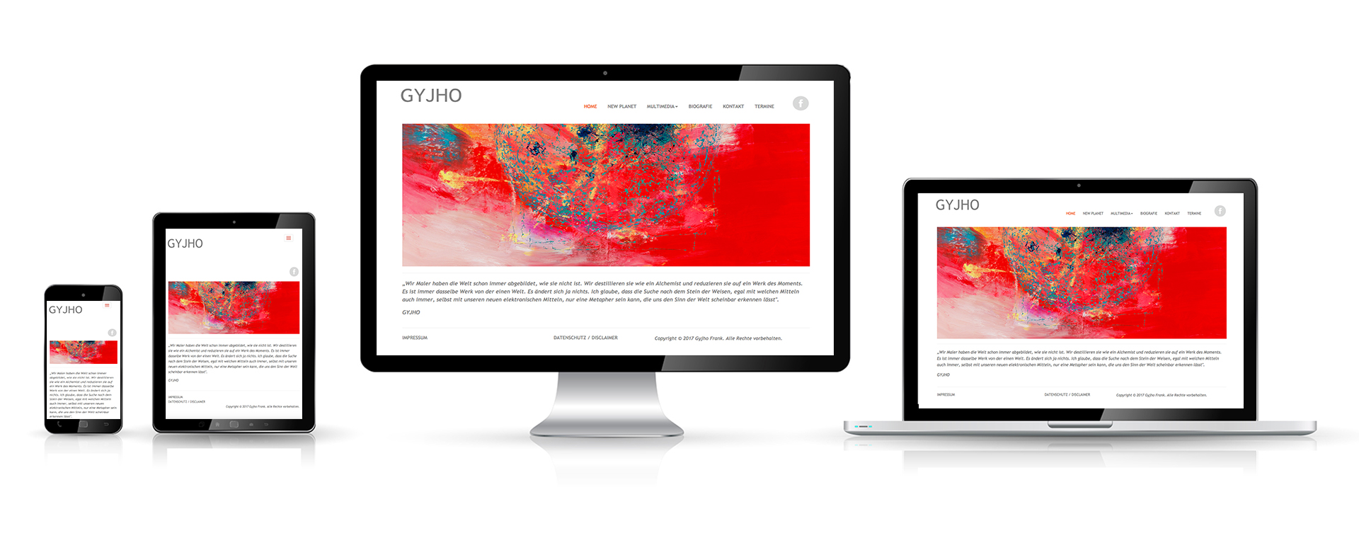
Responsive Webdesign
The responsive web design adapts the design und content to the different screen resolutions of desktops, tablets, smartphones iPhones und iPads. The statistics show an upward trend in the use of these devices to surf the Internet. This requires a change in the design of websites. Search engines like Google now evaluate websites for usability also for smartphones und co. So far, sites have been optimized for a screen resolution of about 1000px.
Stundard resolutions of smartphones und tablets:
Smartphones: 320px - 480px
Tablets: 768px - 1024px
Desktop: 1024px+
The findability of your website through search engines is also dependent on whether your website is responsive.